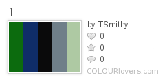
Color by COLOURlovers 1. This colour pallet contains 5 colours which I feel go well together, with the two darker colours, then the strong black, as well as the two paler colours. I feel this would certainly fit the indie genre, and more specifically boys/tomboys.
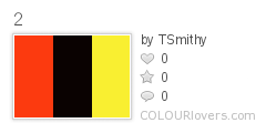
Color by COLOURlovers 2. This pallet consists of red, black and yellow. Although these are all bold colours, they can really make a magazine stand out and this is used on many magazines. I feel this would more appeal to boys.

Color by COLOURlovers 3. These colours look more dingy, but the mustard yellow would certainly fit a folk element. The colours still create a relaxed feeling.
Color by COLOURlovers
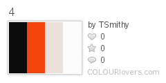
4.This pallet is quite a simple one, however the colours contrast well and the combination of red and black can give something a strong presence on the page.

Color by COLOURlovers
5.In theory this is a boring pallet, however the colours when matched with a vibrant image can create a aesthetic page. They are also simple but authentic, unlike when too much colour is used.
Color by COLOURlovers
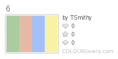
6. This pallet consists of green, red, blue and yellow, but in a pastel style. This gives vibrant colours a more relaxed feel, Something I feel could suit my magazine, especially for folk.
Color by COLOURlovers
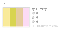
7. The first three colours in this pallet are quite similar, but with the pink they are given a different edge. The use of the pink makes it more girly, so would narrow my target market.

Color by COLOURlovers 8. Again these colours are quite girly, but for an indie genre this can appeal to both boys and girls. I also believe the colours match up well.
No comments:
Post a Comment